Types of Logos Explained: Which One Is Right for Your Business?
Your logo creates the first impression of your brand. Customers notice it before anything else. A strong logo builds trust and recognition. It shapes how people remember your business. Many companies fail due to weak branding. The right logo improves visibility and recall. It supports your marketing strategy effectively. Businesses must choose the correct logo type carefully. Each type serves a different purpose. Some focus on text clarity. Others rely on visual identity. Understanding logo types helps you decide wisely. This guide explains each logo style clearly. You will discover which one suits your business goals best.
Why Choosing the Right Logo Type Matters?
A logo reflects your brand personality clearly. It influences customer perception immediately. A poor design creates confusion. A strong design builds authority quickly. Your logo supports brand identity development. It appears on websites and packaging. It also appears on social media profiles. Consistency strengthens brand recognition over time. The right structure improves visual communication. It ensures clarity across digital platforms. Businesses must align logo style with goals. A tech company needs a modern look. A luxury brand needs elegance. Strategic logo selection improves brand positioning. It also supports long term marketing success.
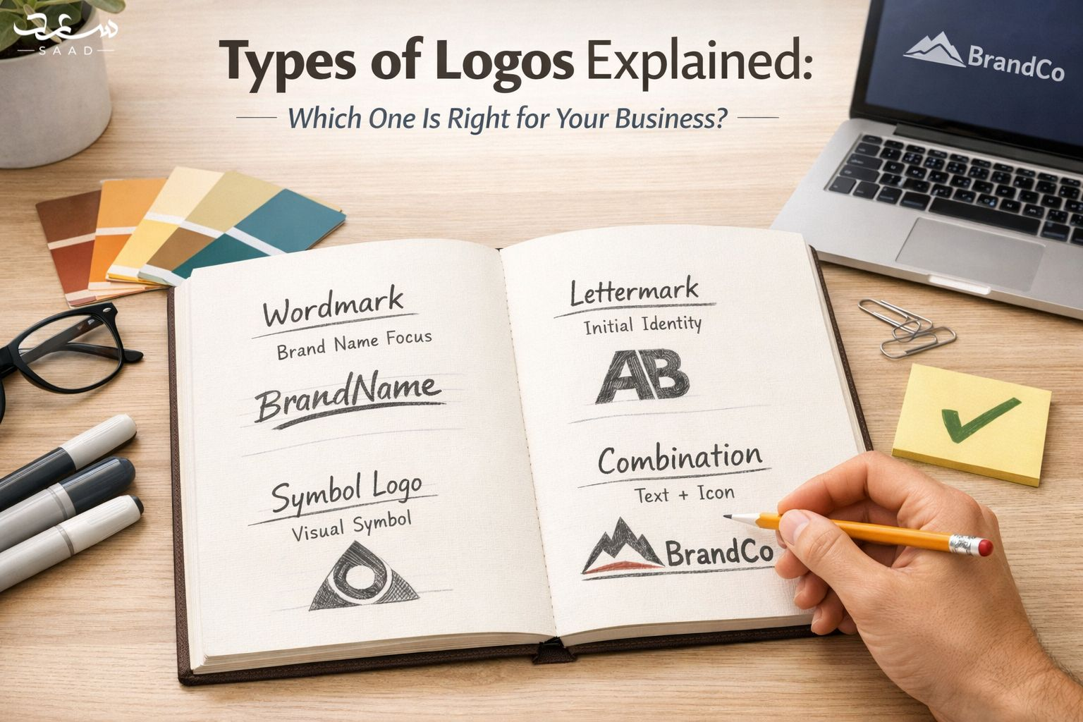
Wordmark Logos and Brand Clarity
Wordmark logos focus only on brand names. They use clean and readable typography. This style suits brands with unique names. It builds strong name recognition quickly. Font selection plays a key role. Simple fonts improve readability across platforms. Bold typography adds confidence and authority. Many global brands use wordmarks successfully. This style works best for short names. It ensures clarity in small sizes. Consistent spacing improves visual balance. Wordmarks support minimal branding strategies. They create professional and modern impressions. Businesses seeking simplicity often choose this type. It delivers clarity without extra graphic elements.
Lettermark Logos for Simple Recognition
Good bilingual identity facilitates business growth. Dubai is a city that is appealing to investors around the globe. Brands have to communicate with locals and expatriates. bilingual design Dubai enhances the cross-cultural appeal. This is a way of enhancing visibility in competitive industries. When brands speak their language, customers feel appreciated. Languages that go well together make it professional. Bilingual content enhances marketing. It also enhances brand recall among the audiences. Coherent design brings about coherent messaging throughout. Companies that embrace the use of bilingual images increase at a faster rate. They gain better market positions at the local market.
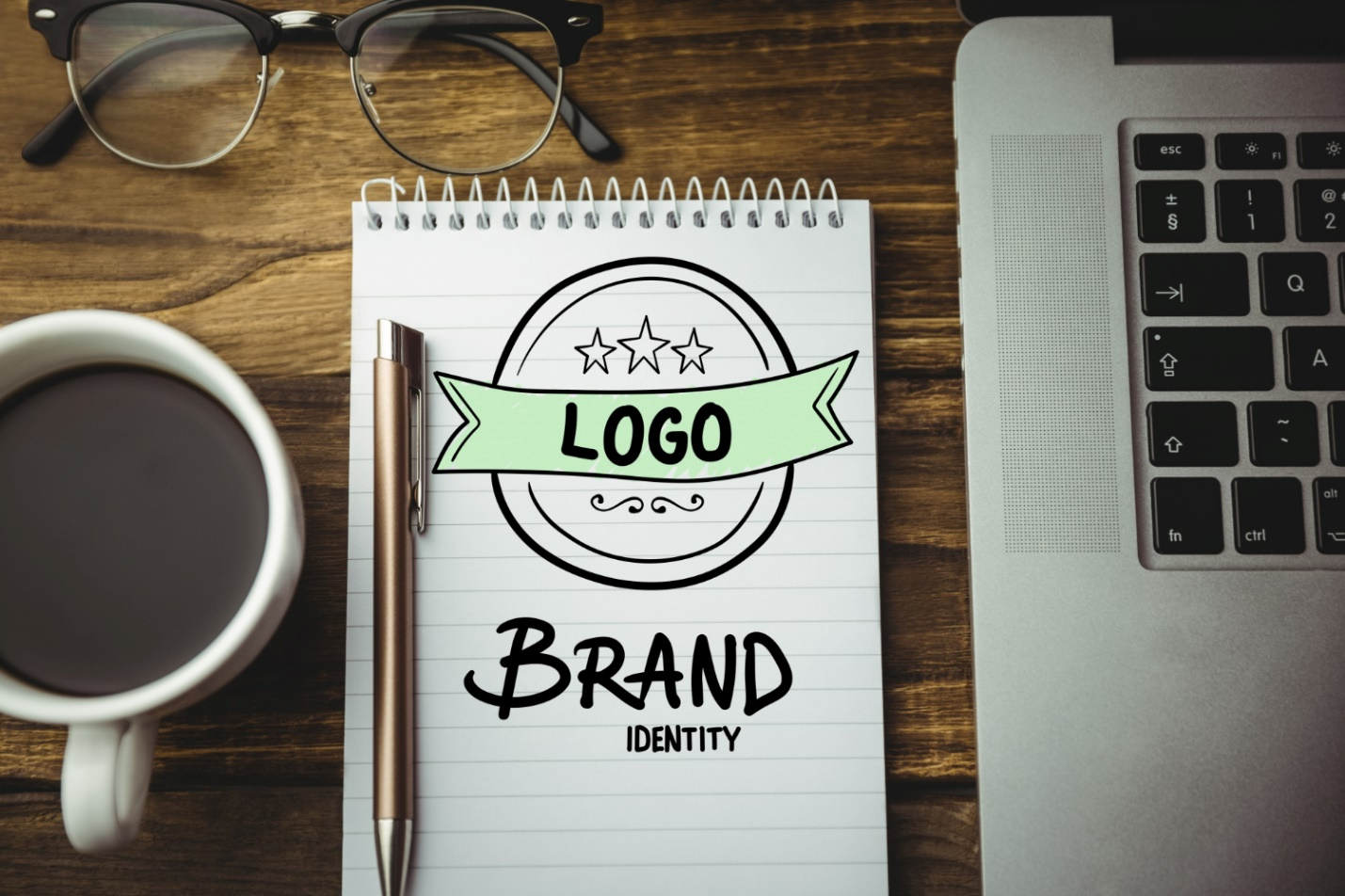
Brandmark Logos and Visual Identity
Brandmark logos use symbols without text. They rely fully on graphic elements. This type requires strong brand awareness. Symbols must reflect company values clearly. Color psychology plays an important role. Shapes influence emotional response instantly. A strong icon builds global recognition. It works well across language barriers. Simplicity ensures better scalability. Unique symbols increase memorability significantly. Businesses aiming for universal appeal prefer this style. Strong visual branding enhances credibility. Careful research ensures the symbol fits industry standards. A clear icon can represent your brand effectively worldwide.
Legal and Cultural Considerations in UAE Branding
Combination logos mix text and symbols together. They offer flexibility and strong branding power. This style balances clarity and creativity. Businesses can separate elements when needed. It supports versatile marketing campaigns. Text ensures name recognition clearly. Symbols enhance visual storytelling powerfully. This type suits growing businesses well. It adapts easily across print and digital media. Balanced proportions improve design harmony. Many startups prefer this format. It creates memorable brand identity quickly. Combination logos work across industries successfully. They provide both meaning and visual strength together.
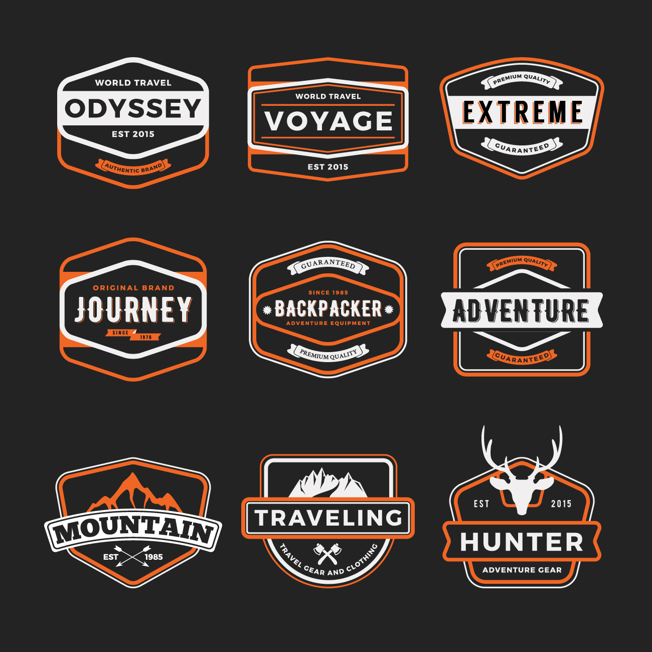
Emblem Logos and Traditional Appeal
Emblem logos place text inside symbols. They often appear formal and authoritative. Schools and institutions prefer this type. It reflects heritage and trust strongly. Detailed design adds classic appeal. Symmetry improves visual balance significantly. Emblems work well on merchandise. They create official and premium impressions. However, scaling requires careful design. Too much detail reduces clarity. Simple layouts perform better digitally. Businesses seeking tradition choose emblem styles. This logo builds credibility over time. It suits law firms and luxury brands. Emblems express legacy and strong brand history clearly.
Mascot Logos for Friendly Branding
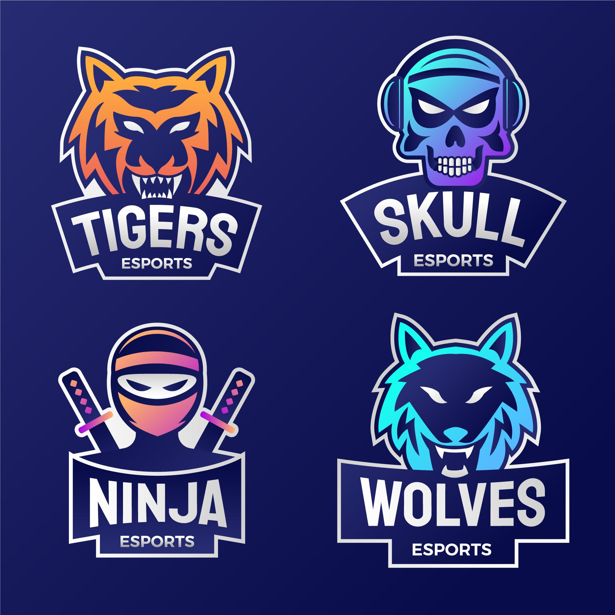
Mascot logos use illustrated characters. They create emotional connections quickly. This type suits family-oriented brands. It works well for entertainment industries. Characters add personality and warmth. Bright colors improve engagement rates. Mascots increase social media interaction. They support storytelling marketing strategies. Consistency ensures character recognition. Clear expressions enhance relatability. Businesses targeting youth prefer mascots. They create fun and welcoming impressions. Strong illustration skills are required here. A memorable character builds loyalty. Mascot logos humanize brands effectively.
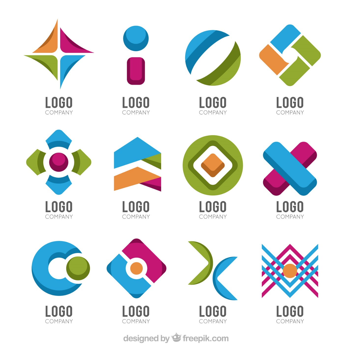
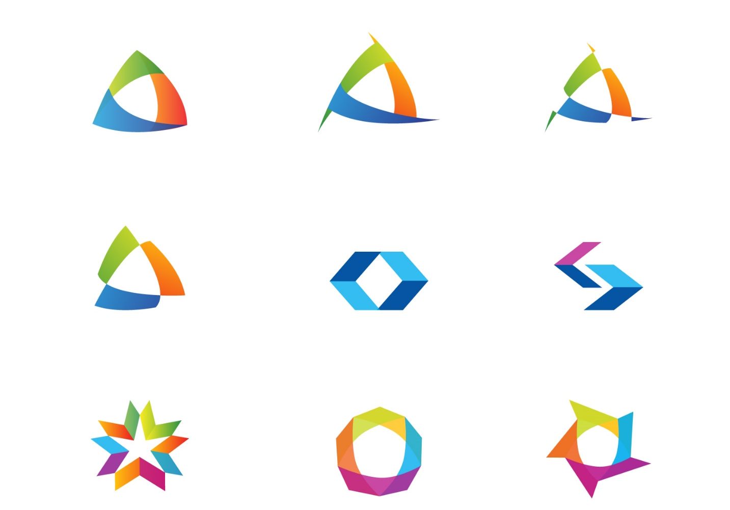
Abstract Logos and Modern Creativity
Abstract logos use unique geometric shapes. They represent ideas creatively. This style supports modern branding needs. It allows artistic freedom strongly. Shapes express movement and innovation. Color combinations enhance uniqueness. Abstract symbols create distinctive identity. They avoid literal interpretations intentionally. Businesses seeking differentiation prefer this type. It works well for tech startups. Simplicity ensures versatility across platforms. Strategic design research remains essential. A strong concept improves brand recognition. Abstract logos express creativity and future vision clearly.
How to Choose the Right Logo for Your Business?
Choosing a logo requires clear strategy. Define your brand values first. Understand your target audience clearly. Analyze competitor branding styles. Consider long term scalability carefully. Think about digital presence strongly. Ensure design supports brand positioning. Simplicity improves memorability and recall. Professional designers ensure visual balance. Strategic thinking leads to better results. Avoid trends without long term value. Focus on timeless and clean aesthetics. Effective logos support marketing campaigns. They increase brand trust gradually. Careful planning ensures sustainable brand growth.
Professional Support for Logo Design in Dubai
Professional expertise ensures quality outcomes. Businesses seeking strong branding need guidance. Skilled designers understand market trends clearly. They apply typography and color theory precisely. Strategic thinking improves visual identity. Logo Design Dubai demands local market understanding. Cultural awareness shapes successful branding. Many brands trust experienced freelancers for projects. Saaddesign delivers tailored visual solutions professionally I collaborate closely with clients personally. I focus on research and creative direction. My approach builds trust and authority. Strong design builds long term brand value.
Conclusion
Choosing the right logo shapes your business future. Each type offers unique benefits. Strategic selection builds recognition and trust. Professional guidance ensures strong results. I bring years of design experience. If you want impactful identity, contact me today. Let us create something powerful together.
Frequently Asked Questions
Combination logos suit startups well.
Yes, they build strong name recognition.
Yes, they express innovation clearly.
Yes professional guidance improves results.
It depends on research and revisions.